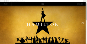
The webpage for the Broadway musical “Hamilton” is almost as innovative and intriguing as the musical itself. Once you open the site, you’re greeted with the musical’s logo – a mustard yellow background, the silhouette of a star (four prongs of a basic star and a man pointing upward to symbolize the top and fifth prong), and the words HAMILTON written across it in white Trajan Bold font. Underneath the logo are distinct silhouettes of all the characters of the play. That’s the header of the webpage and the emphasis because it takes up the entire screen. The navigation bar to the top also is emphasized because it is black. It goes along with the color scheme, but stands out against the mustard yellow of the logo. This design element speaks to the intended audience because this logo is what is familiar to the public. If they had chosen a picture of Alexander Hamilton, there’s a good chance some people would think they landed on a website about the history of Hamilton. It also is a clear indicator that you did not end up on hamilton.com, which is a webpage for a private internet service provider that has nothing to do with the musical at all (I’d know because I made the mistake once of twice). Contrast is used between the header (yellow mustard color) and clickable content (black). I think this follows the color scheme of the logo, but also is a distinction between the two.
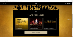
The page is very organized. Underneath the header (on the home page) is a shortcut to “the HAM channel.” People going to this website want at least one of these following things: to get updates, buy/win tickets and buy merchandise. You’re capable of doing this by using the header (there’s an arrow on the side that takes you from page to page) or using the menu in the navigation bar.
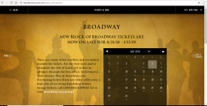
For the most part, the written elements on the site are aligned in the center and are relatively close together. As mentioned in chapter two of Writer/Designer, “a center alignment – an easy and popular choice – cause sour eyes to move around the space with less determination, as we move from the end of one line and search for the beginning of the next one (Ball, 48).” I do think the alignment and proximity of the content is for ease and simplicity.
The webpage is simple and easy to navigate, but is full of the content that people are looking for.
Word Count: 419
Works Cited:
Ball, Cheryl E., Jennifer Sheppard and Kristin L. Arola. Writer/Designer: A Guide to Making Multimodal Projects. Bedford/St. Martin’s, 2018.