I chose to write a post analyzing the landing page for Ugly Duckling Presse. Ugly Duckling Presse is a small press, a “nonprofit publisher for poetry, translation, experimental nonfiction, performance texts, and books by artists. “ I was not exactly sure what to make of the landing page when I first arrived. It is very minimalistic. I agree with Ashleigh’s belief that minimalism has beauty to it – it can be very effective. But for some reason, I felt rather disappointed with the simplicity. I myself am fascinated with small presses, and in my head it is an exciting enterprise. Clearly, Ugly Duckling’s web designers think differently.
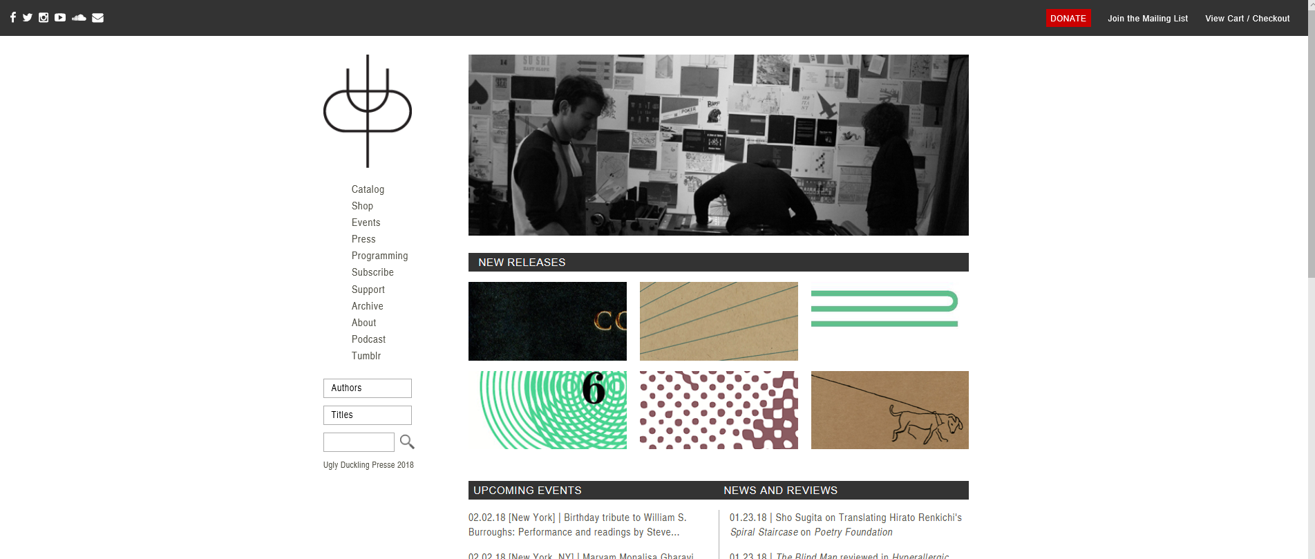
The website is neat with balanced lines. The widgets for the company’s social media are tidied away to the tope left corner. The logo is on display in the top left corner, arranged so that the eye is drawn to it immediately. However, It takes a bit of staring to get an of idea what their logo is or what it means. If you look carefully, you can see that the letters “UDP” are all incorporated into the image.
![]()
There is a great deal of white space, both in the logo, and on the site as a whole. This could be a kind of statement about spaces waiting to be filled – or they could just have like the professionalism of it. That’s what really struck me about the site. Professionalism. All the information is laid out clearly and neatly, with a navigational side bar. It is clear that the designers were more focused on the site being useable to professionals, than it being a marketing tool. They do feature their products at the top of the page, with a link to their store. But the attitude is more “you can buy this if you want,” than “you should buy our stuff!”
The site is mostly black, white, and gray. The only things that break the color scheme are photographs of the products (chapbook covers), and a small red button at the top of the page that says “donate.” Even their version of begging for money is refined and controlled. As a small press, Ugly Duckling needs all the money it can get, and yet nothing about site’s landing page seems to be screaming “we have a product to sell!” It occurred to me that this is very intentional. Ugly Duckling is not catering to the mass market. They don’t really care about advertising, so their site doesn’t need to be an advertisement that draws people in and entertains them.
Small Press poetry and experimental work has a small audience. Those who do come to their landing page, will probably have come there deliberately with a goal already in mind. Their s is not the kind of site you stumble upon while casually browsing the web. Ugly Duckling Press is very aware of this, and so feels no need to “grab” people with their landing page. They don’t try to sell you on anything, because they know the people who want to buy their products will find them.
This professional, simple style took me aback at first. I am not used to a site for an online store being so “non-capitalistic” in its style. No flashy colors grabbing me, just simple indication of where things are. But it is refreshing, and it shows the web-designers have a very strong understanding of the company’s character: Professional, elegant, simple.
Word Count: 579
Sources:
Works Cited
Ball, Cheryl E., Sheppard, Jennifer, and Arola, Kristin L. Writer/Designer
https://www.uglyducklingpresse.org/