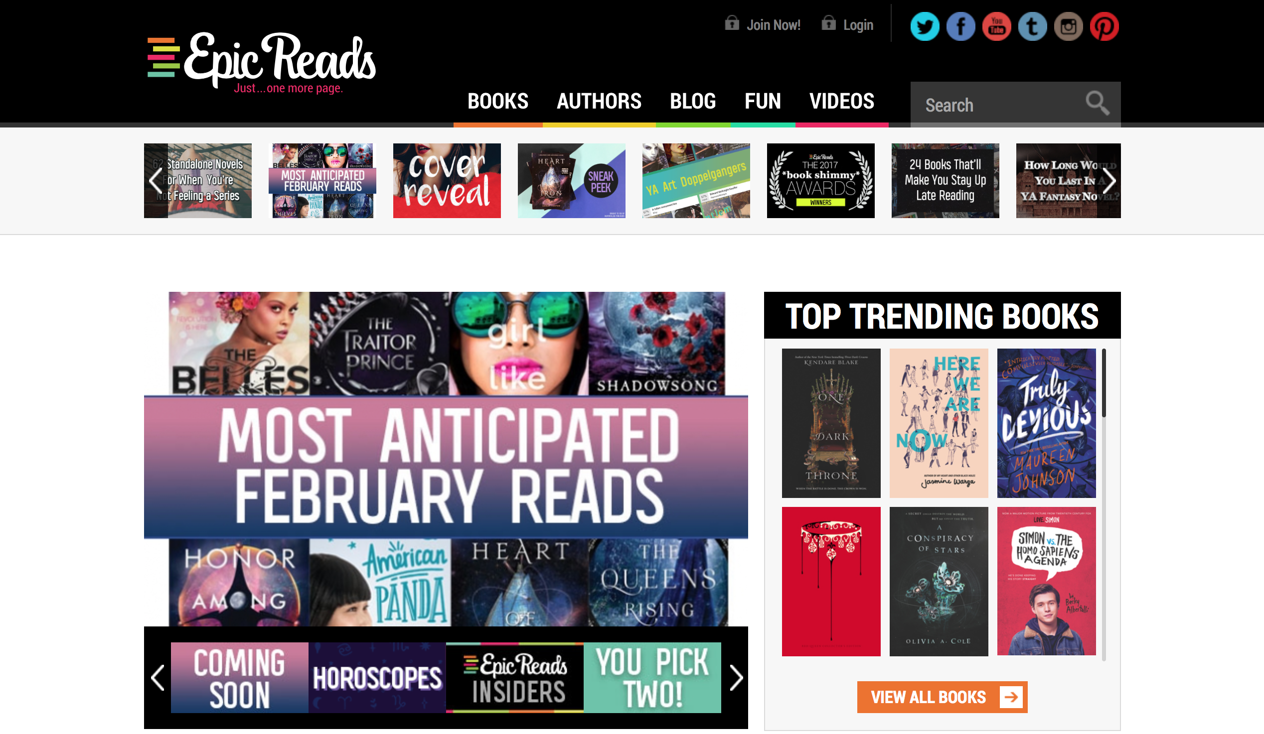
Epic Reads is a digital community created by HarperCollins that caters to Young Adult readers. The site promotes HarperCollins’ YA publications through blog posts, polls and quizzes, online forums, and giveaways. The very top of the site, which remains the same no matter what content you are looking at, includes the Epic Reads logo, which is linked to the homepage, the categories of content that are linked, a permanent search bar, and various social media icons, which are linked to the Epic Reads’ social media accounts. The Epic Reads website places a great deal of emphasis on showcasing their articles. The featured article, titled “Most Anticipated February Reads”, is the largest part of the homepage, and it is the first thing you see on the page. Situated right next to the most recent post is a list of the currently trending books. As you scroll farther down the page, content is divided into categories; Recent Posts, Ebook Deals, Videos, Fun Things, and Social. Each of these categories has its own navigation bar that showcases new and popular content. As pointed out in Writer/Designer, the page has more than one intended audience. Although the Epic Reads site caters to the interests of Young Adult readers, it is also intended to draw in adults who want to see what’s trending in the YA genre, whether that be writers, other publishers, or parents. The page itself is split up into simple, easily understood categories, making it easy for younger teens and adults alike to navigate the page. Similar to the background of Spotify’s site, the background of the Epic Reads’ page is plain (Although it is white, while Spotify’s is black), showcasing the headings and links, which are bright, exciting colors. The font is very simple, with headings in all caps, making them very easy to read.
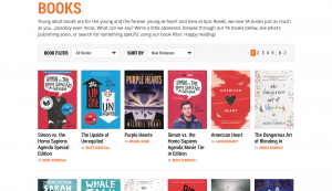
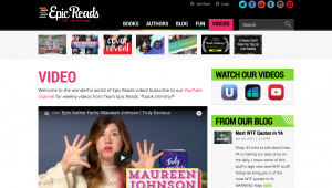
The Epic Reads site reads left to right and up to down, and places the most emphasis on the content at the top of the pages, which is shown both by the order the content is placed in. The Author and Books tabs function like a database, where the most recent content is displayed first. On both pages, you can filter the results based on genre, date, or alphabetical order. On the Blog page, the content is filtered by release date, with the most recent posts at the top. On the right is a list of categories and dates to narrow down the posts that are displayed. The videos tab functions much the same, with the most recent video displayed and a link to Epic Reads’ Youtube channel. The Fun tab is split into three categories: giveaways, quizzes, and polls. Each category has the most recent content displayed on the far left. In general, each piece of content is evenly placed on the page, with the homepage being the only page where content is positioned with slightly different proximity and various sizes.
Unlike Youtube’s Homepage, the Epic Reads site does not have any advertisements. This is most likely because the website itself is an advertisement for HarperCollins material, and other advertisements may deter visitors from HarperCollins content. Overall, the Epic Reads website is very vibrant and exciting. It has multiple elements that shift your attention all over the page, making it very easy to look at all of the content on the screen rather than just one specific piece.
Word Count: 567
Works Cited: